
Quiet Time
Journaling app for the everyday
The Problem
Users need a space to centralize their journaling, for entries online and offline
Keeping physical copies of journals become unrealistic when time and size increase.
Also journal entries can get lost or decentralized, due to lost or ruined notebooks,
to name one reason. To counterfeit these problems, users need a space that centralizes
their entries while keeping their format and objective distinct.
The Goal
Design and develop a catered solution for a centralized journaling space, both online and offline
Centralizing offline and online journal entries creates a valuable space for the user to keep track of their thoughts and be ensured that content will not get lost.
User Research
Creating empathy and efficiency in the design process
Core Functionalities
As MVP, QuietTime offers:
Design Process
During the first iteration, I approached making the main page of the product be a grid of entries, so users could easily identify the title and date.
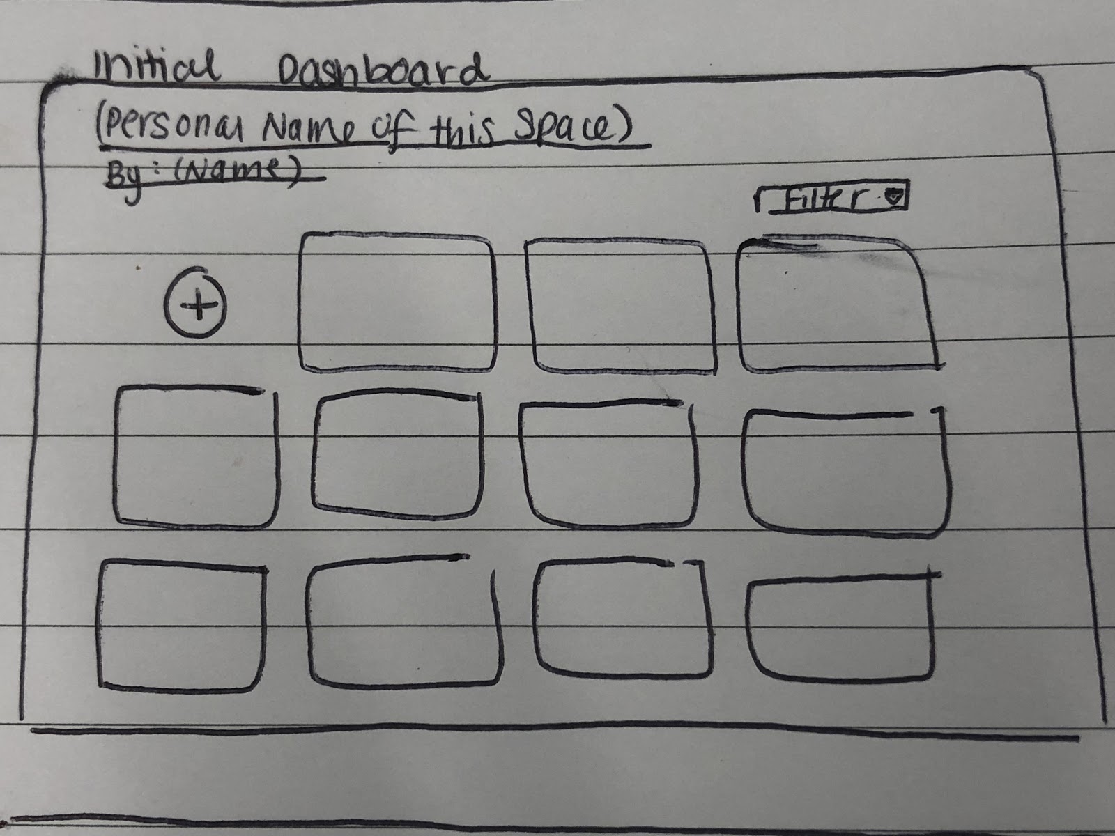
However, I thought that as the number of entries grew, this option would not be scalable. Also, my initial vision for the product being as closely related to a real notebook entry was not reflected in this design.
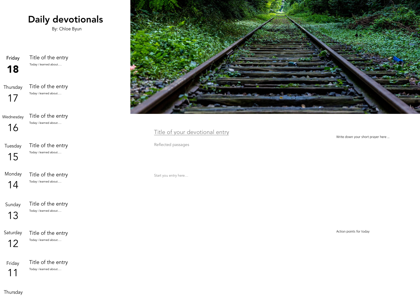
With continuous iteration, the skeleton of the design above is what QuietTime has adopted.
It has the entry list on the left side of the screen, and majority of the screen is allotted for the journal entry. Although there are guided aspects within the page, the empty page allows for the user to take control of their entry and write simple journal entries or specific event targetted entries.
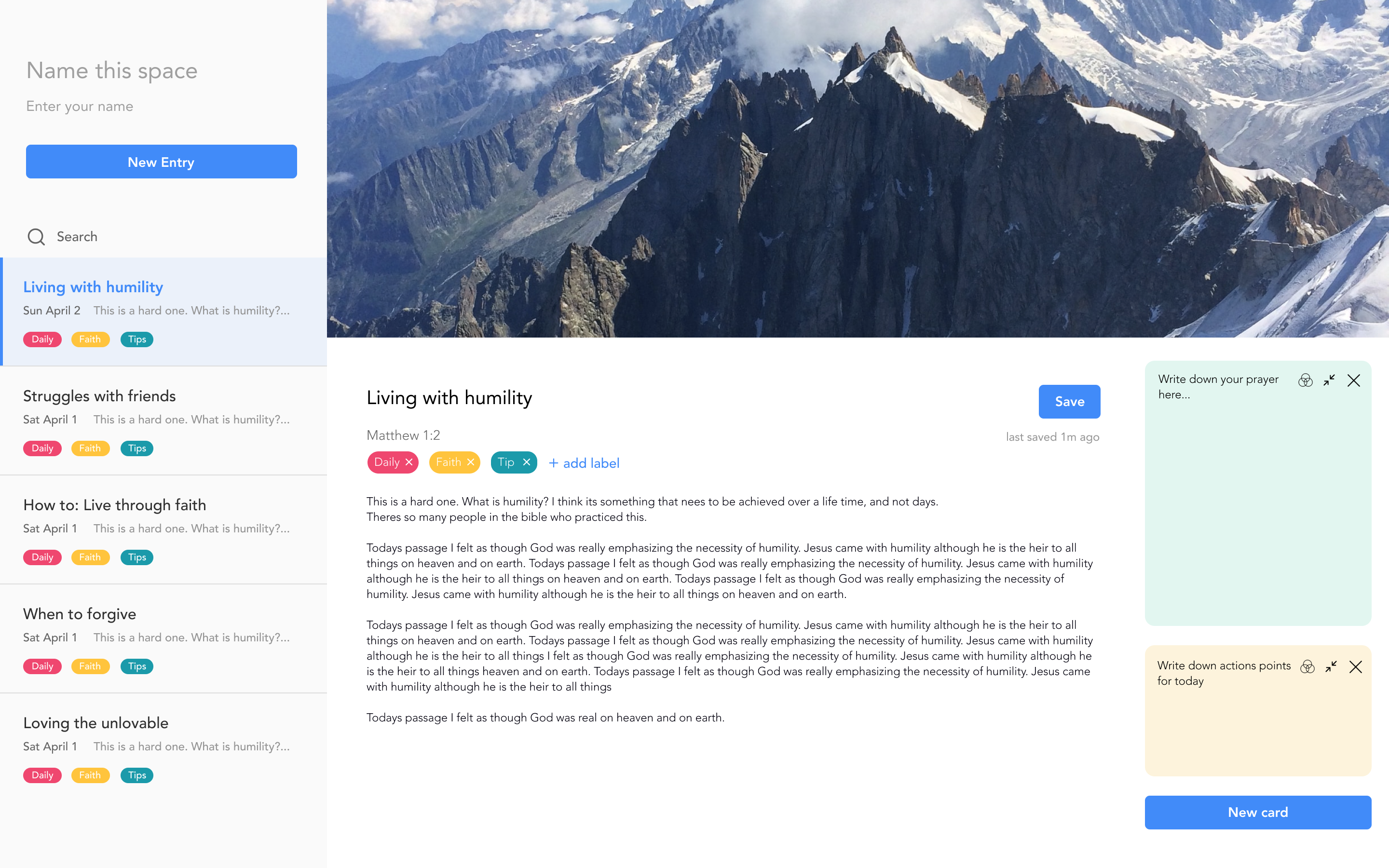
Currently, the UI has a scrollable left-side so that previous entries can be scanned with ease, while maintaining the current entry on page.
However, I thought that as the number of entries grew, this option would not be scalable. Also, my initial vision for the product being as closely related to a real notebook entry was not reflected in this design.
With continuous iteration, the skeleton of the design above is what QuietTime has adopted.
It has the entry list on the left side of the screen, and majority of the screen is allotted for the journal entry. Although there are guided aspects within the page, the empty page allows for the user to take control of their entry and write simple journal entries or specific event targetted entries.
Currently, the UI has a scrollable left-side so that previous entries can be scanned with ease, while maintaining the current entry on page.
Competitive Analysis
Understanding the market
Day One Journal
Day one journal offers simple UI/UX across all screen sizes that users love and appreciate. It has the right amount of feature sets
that do not over or underwhelm its users. However, over the years as the product developped,the paid-tier plans decreased customer loyalty
as users were overwhelmed by the growth of the application.
Penzu
This is a great product that focuses on privacy of the content. It allows for ease of syncing entries, both text and photos, to the web for free.
However, paid users feel as though the paid subscriptions do not offer much more than a free account. The retention of users seem lacking for this product.
Color Palette & Typeface
Color Palette:

Font Palette:
Font Palette:
Development
Technical Architecture
React, EmotionJS, Firestore
User Testing & Validation
Iterating through feedback
Coming soon!
Next Steps
Continuous improvment & development
Coming soon!